English
 Arabic
 French
 Spanish
 Portuguese
 Deutsch
 Turkish
 Dutch
Dutch
 Italiano
 Russian
 Romaian
 Portuguese (Brazil)
 Greek
Greek
The End-to-End Ecosystem: The 5G Mm-Wave Technology Market Platform Explained
Other |
2026-10-06 10:29:37
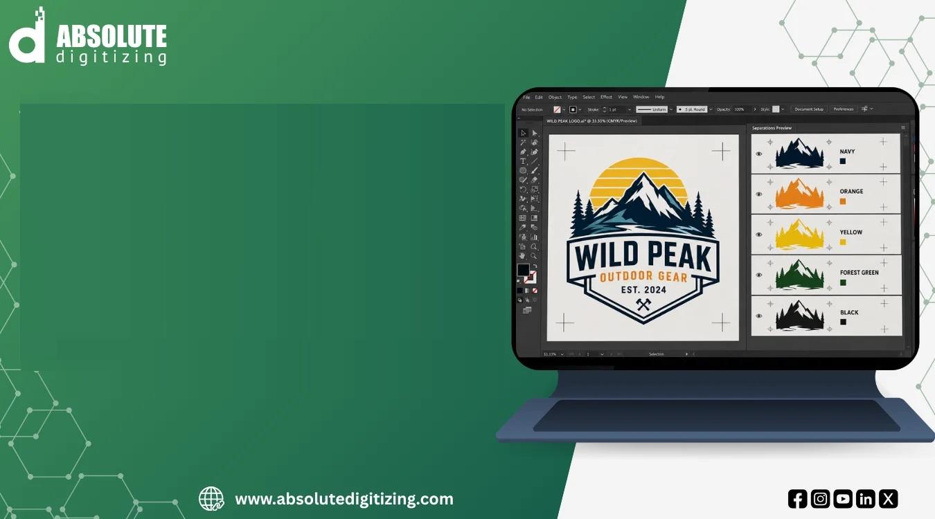
A colorful logo may look perfect on your screen, but getting that artwork ready for production is a different story. If every color is mixed together, printing or manufacturing the design can become slow, confusing, and costly.
That is where color separating vector graphics becomes important. Color separation breaks artwork into individual color elements so each part can be processed, printed, edited, or reproduced correctly.
Whether you are preparing artwork for screen printing, embroidery, apparel decoration, signage, or other production work, clean color separation can make the entire process smoother.
Color separating vector graphics are vector-based designs divided into separate color components. Each color can be isolated, edited, and prepared for a specific production process.
Unlike raster images made from pixels, vector artwork uses paths, shapes, and mathematical information. This allows designs to remain sharp when resized.
For example, imagine a logo containing:
Instead of treating the logo as one flat image, a properly separated vector file organizes these colors into manageable elements.
This gives a printer or production team better control over the artwork.
Color separation is more than simply changing colors in a design. It is about preparing artwork so each color behaves correctly during production.
Poor separation can lead to:
A cleanly separated file helps reduce these problems before the artwork reaches production.
When colors are separated, individual elements can be adjusted without affecting the entire design.
For example, if a customer wants a blue logo changed to green, the specific color layer can be edited without rebuilding the complete artwork.
Many printing methods require individual color information.
Separating artwork allows production teams to create the required color plates, screens, or other production elements.
Good separation also helps preserve the intended appearance of a design. Edges, overlaps, outlines, and small details can be carefully prepared instead of leaving everything to automated processing.
The process can vary depending on the artwork and final application, but the basic workflow is fairly simple.
First, examine the design carefully.
Look for:
This helps determine how the artwork should be separated.
The next step is to identify the actual production colors.
Similar shades may need to be combined, while colors that appear visually close may need to remain separate.
The goal is not always to preserve every color in the original image. Production requirements often determine how many colors should be used.
Each major color is then organized into its own editable component.
This makes it easier to inspect the design and identify problems.
For example, a four-color logo might be organized into four primary color groups, along with any required outlines or special elements.
This is one of the most important parts of the process.
Objects may overlap intentionally, but poor overlaps can create unwanted gaps or color problems.
Edges should be checked carefully so the final output looks clean.
Once the colors are separated and checked, the artwork can be saved in a suitable vector format.
Depending on the workflow, formats such as AI, EPS, PDF, or SVG may be used.
The correct format depends on the software and production method.
Screen printing is one of the most common applications for color-separated artwork.
Each ink color may require its own screen or production setup. That means the artwork must clearly identify which parts belong to each color.
For example, a five-color shirt design may require five separate color channels or production elements.
Good separation helps with:
Registration refers to how accurately different colors line up during printing.
Even a small alignment problem can become visible when several colors meet.
Properly prepared artwork can include techniques such as trapping or intentional overlaps to help reduce visible gaps.
Vector artwork can also be useful when preparing designs for embroidery digitizing.
An embroidery machine does not stitch a vector file directly. Instead, the artwork must first be converted into an embroidery design using stitches.
However, clean color separation can help a digitizer understand:
This can make the digitizing process more organized.
At Absolute Digitizing, properly prepared artwork can provide a stronger starting point for creating production-ready embroidery designs.
Understanding the difference between vector and raster artwork is important.
Vector files use paths and shapes. They can usually be resized without losing sharpness.
Common vector formats include:
Vector artwork is often preferred for logos, illustrations, signs, and production graphics.
Raster images are made from pixels.
Common raster formats include:
Raster images can be useful for photographs and detailed images, but enlarging them too much can make them blurry.
When a raster image is used for production, it may need to be recreated or converted into vector artwork before clean color separation can take place.
Not every design is easy to separate.
Some artwork requires careful manual work because of its complexity.
Gradients contain smooth transitions between colors. Separating them for processes that use solid inks can require special techniques.
The designer may need to simplify the gradient or use halftones to recreate the visual effect.
Transparent objects can overlap other colors in complicated ways.
These areas should be checked carefully because the appearance on screen may not match the result after production.
Tiny text and narrow shapes can disappear or become difficult to reproduce.
A design that looks clear at large size may not work the same way when printed or embroidered at a smaller size.
Using dozens of colors may look attractive digitally, but it can increase production complexity and cost.
For some projects, simplifying the palette creates a more practical design.
If you are preparing artwork for production, a few simple habits can make a big difference.
Use meaningful layer names and keep related elements together.
This makes the file easier for another designer or production team to understand.
Make sure colors are defined correctly for the intended production process.
For print work, this may involve CMYK or spot colors. The exact color system should match the printer's requirements.
Zoom in and inspect fine lines, tiny text, and narrow spaces.
Then check the artwork at its actual production size.
Effects such as complex transparency, shadows, and gradients can make production more difficult.
If an effect is not essential, consider whether it can be simplified.
Before sending the final file, inspect every color component.
Check for:
A final quality check can prevent expensive production mistakes.
Some designs are simple enough to separate yourself. Others can become complicated very quickly.
Professional vector art services can be useful when you have:
A professional can also identify problems that may not be obvious when viewing the artwork on a computer screen.
For businesses, outsourcing complex artwork preparation can save time and reduce repeated production corrections.
Color separation also matters for businesses that use the same logo across different products.
Your logo might appear on:
Each application may have different production requirements.
Keeping a clean master vector file makes it easier to create consistent versions for different uses while preserving the core appearance of the brand.
Before sending separated artwork to production, review these points:
Color separating vector graphics plays an important role in turning digital artwork into production-ready designs. By separating colors, cleaning edges, managing overlaps, and organizing vector elements, you can make artwork easier to print, edit, digitize, and reproduce.
The key is to think beyond how the design looks on your screen. A successful production file must also work with the process that will create the physical product.
Whether you are preparing a simple logo or a complex multi-color illustration, careful color separation can help create cleaner results and a more efficient workflow.
They are vector designs divided into individual color elements. Each color can be independently edited and prepared for production.
Color separation helps production teams manage individual inks or color components. It can improve alignment, consistency, and overall production accuracy.
A JPG can be analyzed and separated, but because it is a raster image, it may first need to be recreated or converted into clean vector artwork for better results.
Yes. While embroidery machines require stitch-based files, separated vector artwork can provide useful visual information for embroidery digitizing.
Professional help can be useful for complex logos, multi-color illustrations, gradients, detailed artwork, and files that must meet specific production requirements.